CLIENT: Seville's Sour Orange Soda
PROJECT: Brand Identity
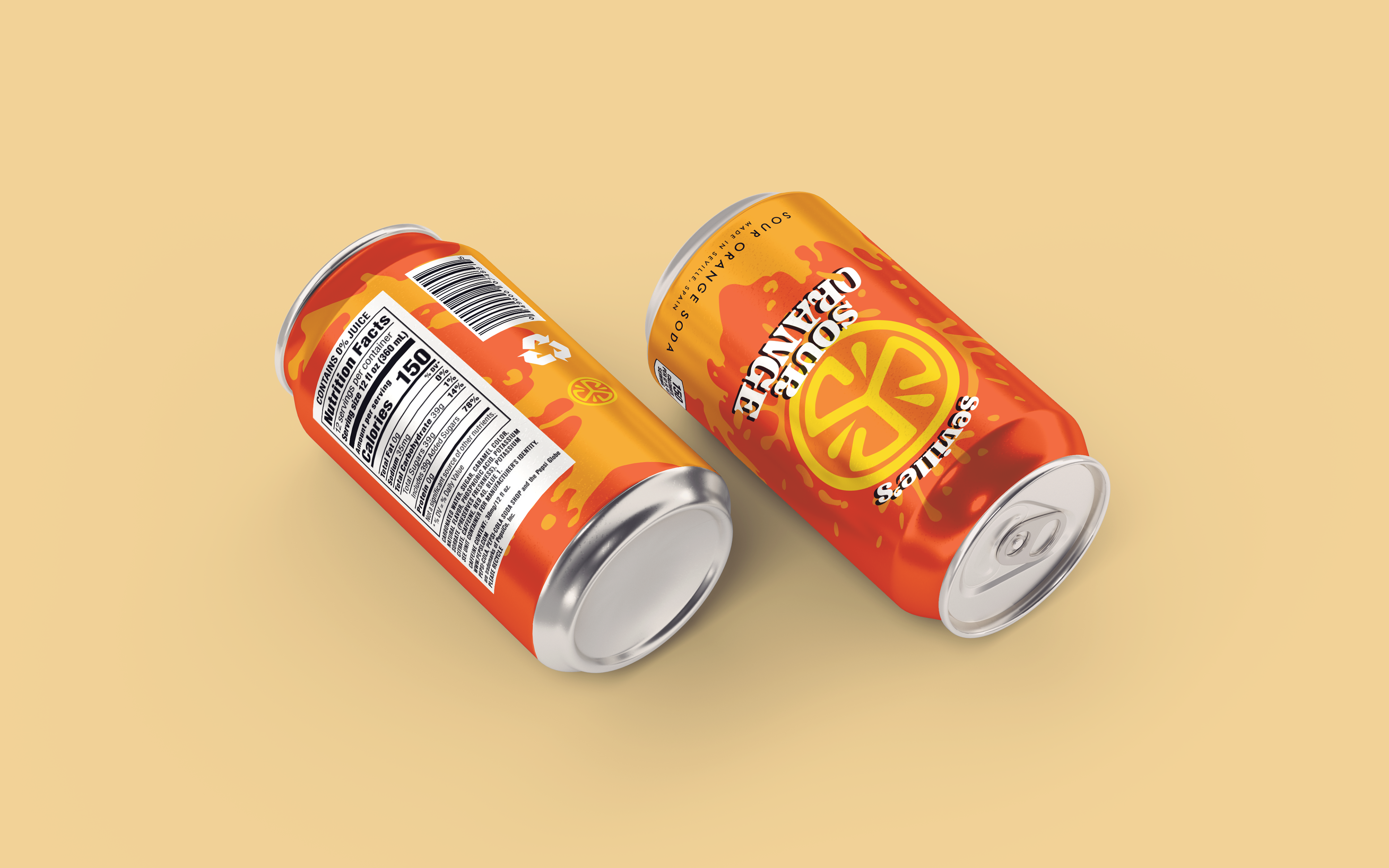
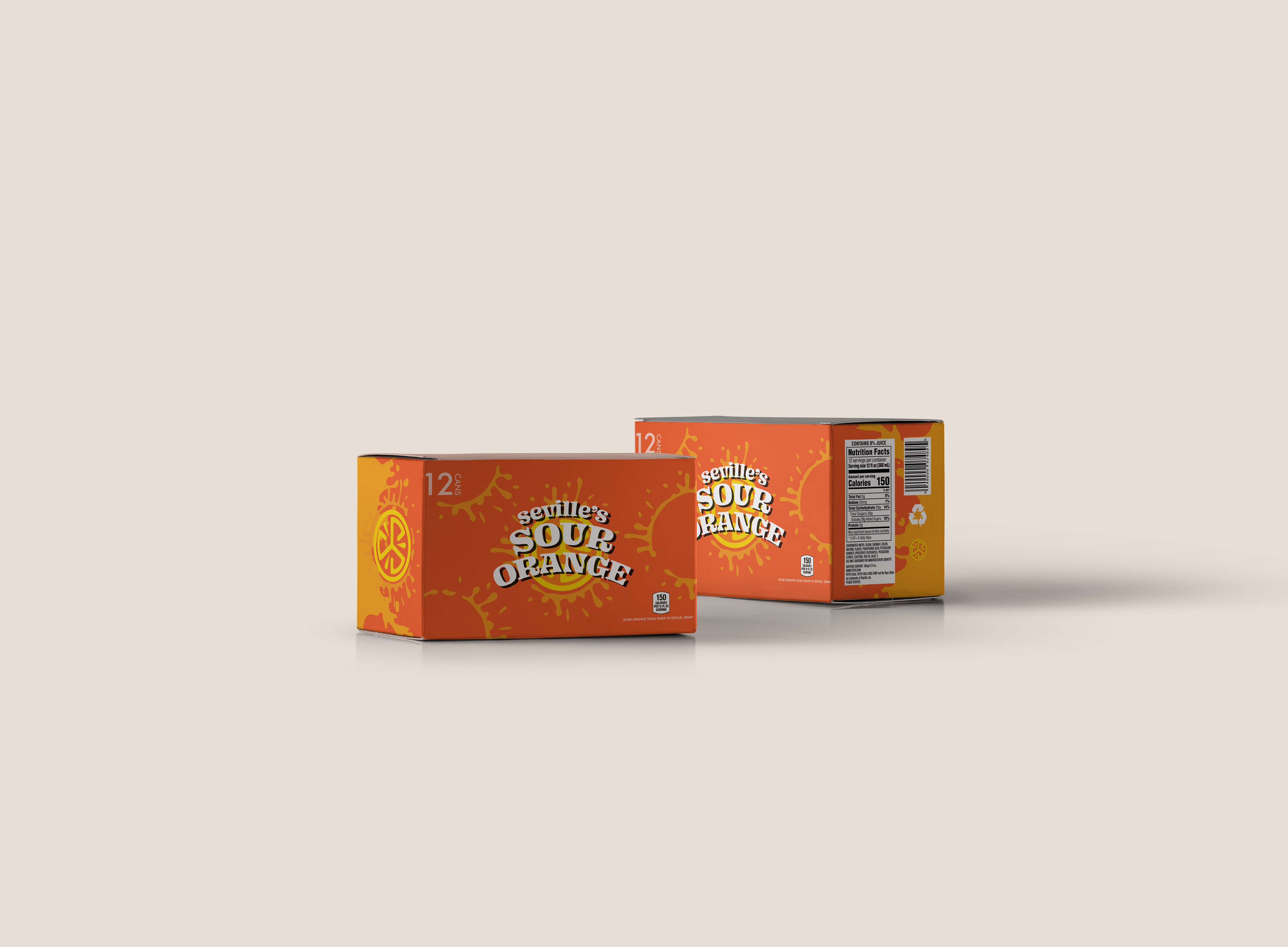
OVERVIEW: The requirement for this project was to create & curate a brand identity based on
a single visual element. I made Seville’s Sour Orange Soda, a company set in Seville,
Spain. The challenge was to create an engaging brand, catered to the correct audience
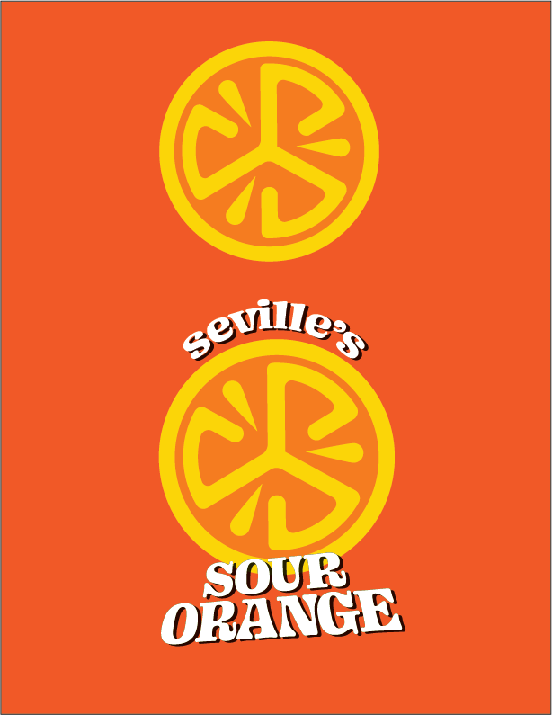
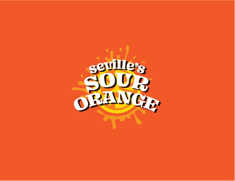
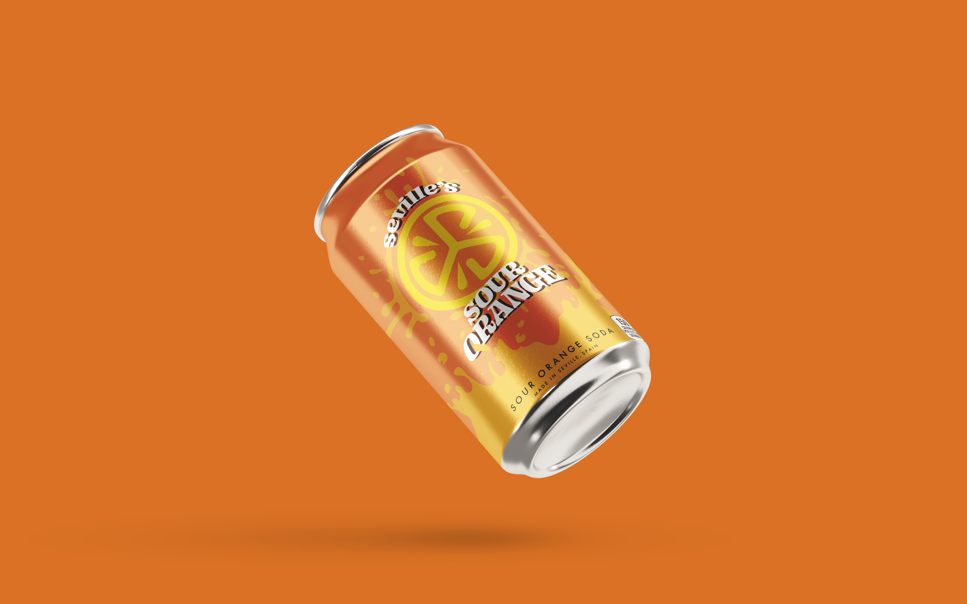
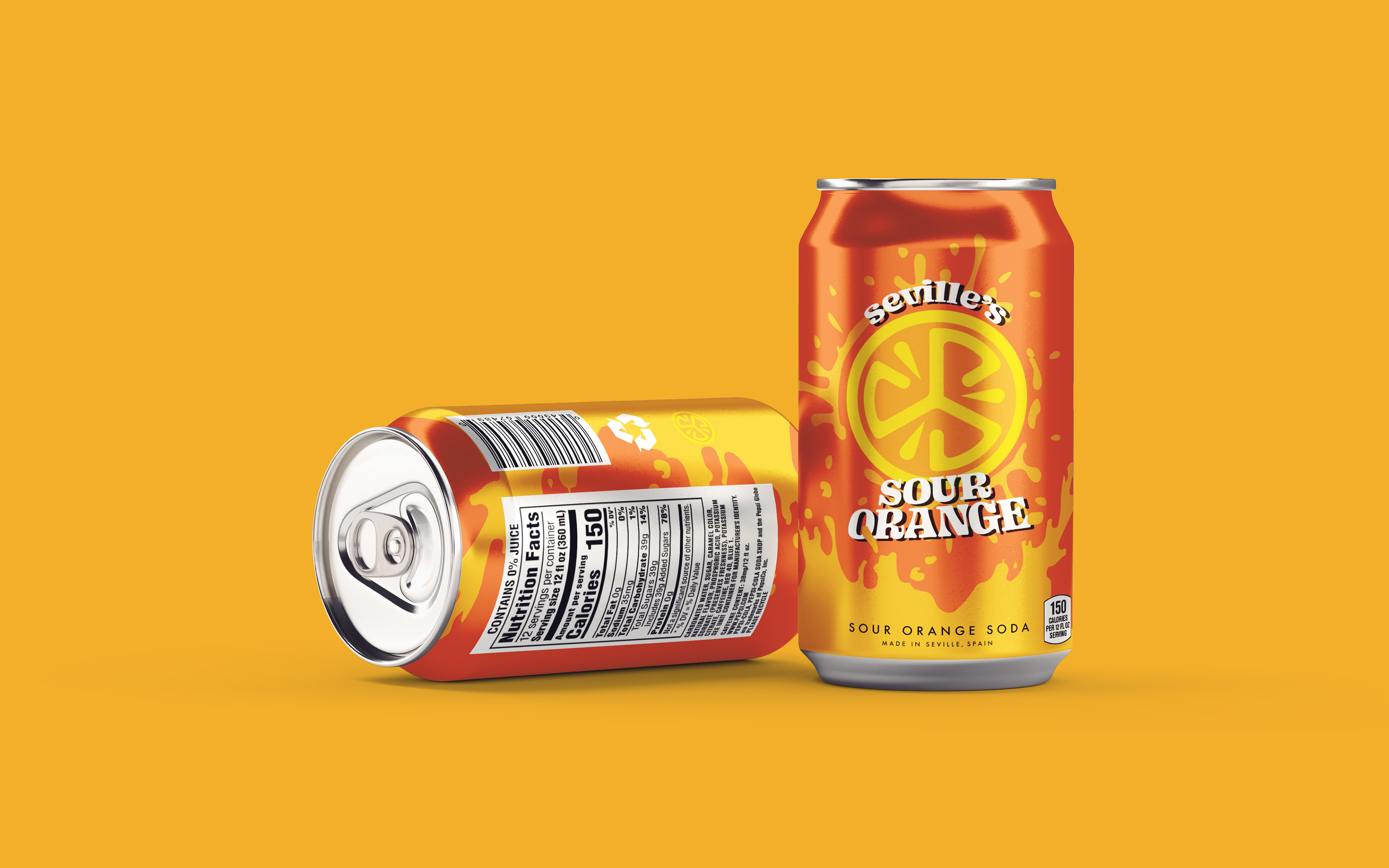
& tactfully incorporating said elements with an attention to detail. The solution was to develop a bright, fun brand that alludes to the “sour” orange. The logo is reminiscent of the toxic symbol, & bright oranges & yellow make it stand out. Implementing an playful font brought it all together.
filler text!
